library(tidyverse)
library(rafalib)Samsung Fitbit - Clusters
Data
The data is from the University of California, Irvine. You can find more information about the data, download instructions… in Samsung Fitbit - Tidying page. Since the data is already on our drive we can proceed to load it locally.
The study creating this database involved 30 volunteers “performing activities of daily living (ADL) while carrying a waist-mounted smartphone with embedded inertial sensors. … Each person performed six activities … wearing a smartphone (Samsung Galaxy S II) on the waist. … The experiments have been video-recorded to label the data manually.
The obtained dataset has been randomly partitioned into two sets, where 70% of the volunteers was selected for generating the training data and 30% the test data.”
Packages
Load
Load function
We’ll use the function we created in the Tidying file above, and load the data into R
subject_train <- read.table("D:/Education/R/Data/har/unzipped/UCI HAR Dataset/train/subject_train.txt", quote="\"", comment.char="")
x_train <- read.table("D:/Education/R/Data/har/unzipped/UCI HAR Dataset/train/X_train.txt", quote="\"", comment.char="")
y_train <- read.table("D:/Education/R/Data/har/unzipped/UCI HAR Dataset/train/y_train.txt", quote="\"", comment.char="")
features <- read.table("D:/Education/R/Data/har/unzipped/UCI HAR Dataset/features.txt", quote="\"", comment.char="")
labelfile <- read.table("D:/Education/R/Data/har/unzipped/UCI HAR Dataset/activity_labels.txt", quote="\"", comment.char="")
Merge
The data from the x and y_train files will be merged together with the subject file into trainfile
trainfile <- cbind( x_train,subject_train,y_train)Extract colnames
- Extract the column names from features and assign to features
- Create column names for the first two vars/columns, name them c(“subject”, “activity”)
- Assign what was extracted into features to the other column headers/names
- Assign all the names to the dataset trainfile
# Extract second column of the df which contains all the column names (features)
features <- features[,2]
# Add column nameses/labels col1 =subject   col2=activity  col3...=feature
cnames <- c(features,"subject","activity")
colnames(trainfile) <- cnames
Review data
Let’s look at labelfile
head(labelfile) V1 V2
1 1 WALKING
2 2 WALKING_UPSTAIRS
3 3 WALKING_DOWNSTAIRS
4 4 SITTING
5 5 STANDING
6 6 LAYINGEdit headers
- Replace some of the headers
- Convert all the labels to lower case
- Match each integer in trainfile$activity with the corresponding activity label from labelfile
# Edit labels
labelfile[labelfile == 'WALKING_UPSTAIRS'] <- 'walkingup'
labelfile[labelfile == 'WALKING_DOWNSTAIRS'] <- 'walkingdown'

# convert label to lower case, and replace numbers in dataset(trainfile) with
# matching activity label from col2 in labelfile
trainfile$activity <- case_match(
        trainfile$activity,
        trainfile$activity ~ tolower(labelfile[trainfile$activity,2]))
Tidying
dim(trainfile)[1] 7352 563Names
Let’s look at the variable names for the first 12 columns.
names(trainfile)[1:12] [1] "tBodyAcc-mean()-X" "tBodyAcc-mean()-Y" "tBodyAcc-mean()-Z"
[4] "tBodyAcc-std()-X" "tBodyAcc-std()-Y" "tBodyAcc-std()-Z"
[7] "tBodyAcc-mad()-X" "tBodyAcc-mad()-Y" "tBodyAcc-mad()-Z"
[10] "tBodyAcc-max()-X" "tBodyAcc-max()-Y" "tBodyAcc-max()-Z" Table
Let’s see how the activity count breaks down.
table(trainfile$activity)
     laying     sitting    standing     walking walkingdown   walkingup
       1407        1286        1374        1226         986        1073
Extract
Let’s extract part of the dataset instead of exploring the entire file.
- So let’s extract the data for just one subject into sub1
sub1 <- subset(trainfile, subject == 1)Factor
Let’s transform the activity variable to a factor so we can group by it
sub1 <- transform(sub1, activity = factor(activity))Let’s look at the size of sub1
dim(sub1)[1] 347 563Case Study
Is the correlation between the measurements and activities good enough to train a machine? So that, “Given a set of 561 measurement would a trained machine be able to determine which of the 6 acitivities the person was doing without using the value from the activity variable?
Average Acceleration
Visualization
- Let’s plot the first two vars: tBodyAcc-mean()-X and Y that are in columns 3&4.
- Those variables stand for the X and Y components of the Body Average Acceleration
You can see from the plots that walking shown in the two blue shades, are more active specially in the horizontal (x-axis) direction than let’s say the passive activities (black, red, and green)
par(mfrow = c(1,2), mar = c(5,4,1,1))
plot(sub1[,1], col=sub1$activity, ylab = names(sub1[1]))
plot(sub1[,2], col=sub1$activity, ylab = names(sub1[2]))
legend("bottomright",
       legend = unique(sub1$activity),
       col = unique(sub1$activity),
       pch = 1 )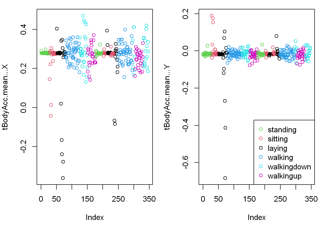
Clustering
Distance matrix
Let’s create a matrix, distancematrix of the first 3 variables/columns of sub1 (the subset dataset) which are in columns (3:5).
distancematrix <- dist(sub1[,1:3])Clustering variable
Now create the variable hclustering by calling the hclust function and passing it distancematrix as an argument (it will use the Euclidean distance as its default metric).
hclustering <- hclust(distancematrix)myplclust
lab.col
- Now call the pretty plotting function myplclust with 2 arguments.
- The first is hclustering, (the hclust object created above) and
- The second is the argument lab.col (the label color) set equal to the activity: unclass(sub1$activity)
myplclust(hclustering, lab.col = unclass(sub1$activity))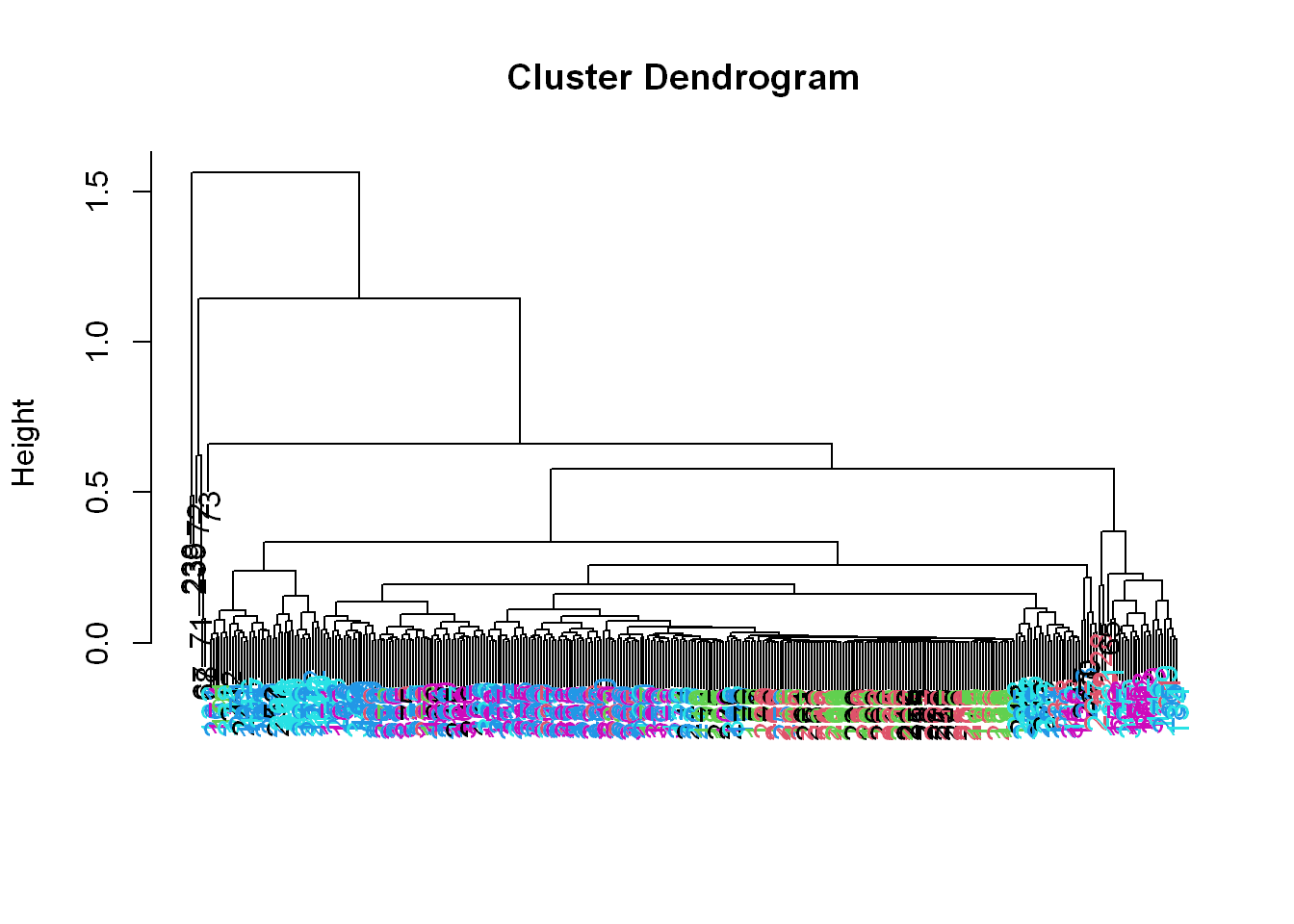
Well that dendrogram doesn’t look too helpful.
- There’s no clear grouping of colors, except that active colors (blues and magenta) are near each other as are the passive (black, red, and green).
- So average acceleration doesn’t tell us much.
- How about maximum acceleration?
Maximum acceleration
Visualization
- Let’s look at that for the first subject (in our array sub1) for the X and Y dimensions.
- These are in column 12 and 13.
- Here they are below plotted side by side, X dimension on the left, and Y on the right.
- The x-axis show the 300+ observations, and the y-axis the maximum acceleration.
par(mfrow = c(1,2))
plot(sub1[,10], pch = 19, col=sub1$activity, ylab = names(sub1[10]))
plot(sub1[,11], pch = 19, col=sub1$activity, ylab = names(sub1[11]))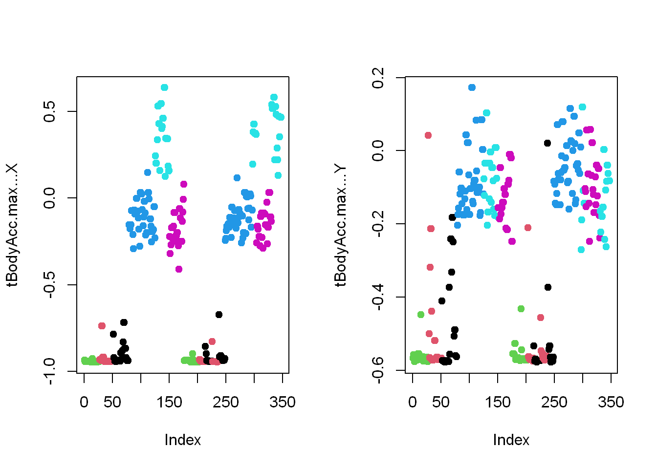
# legend("bottomright",
#        legend = unique(sub1$activity),
#        col = unique(sub1$activity),
#        pch = 1 )
Clustering
Let’s focus then on the 3 dimensions of maximum acceleration (X, Y, Z) stored in columns 12 through 14 of sub1.
- Create a new distance matrix distancematrix, of these 3 columns of sub1, by using the dist function. Again, use the x[,12:14] notation to catch the columns.
distancematrix <- dist(sub1[,10:12])Clustering variable
hclustering <- hclust(distancematrix)myplclust
myplclust(hclustering, lab.col = unclass(sub1$activity))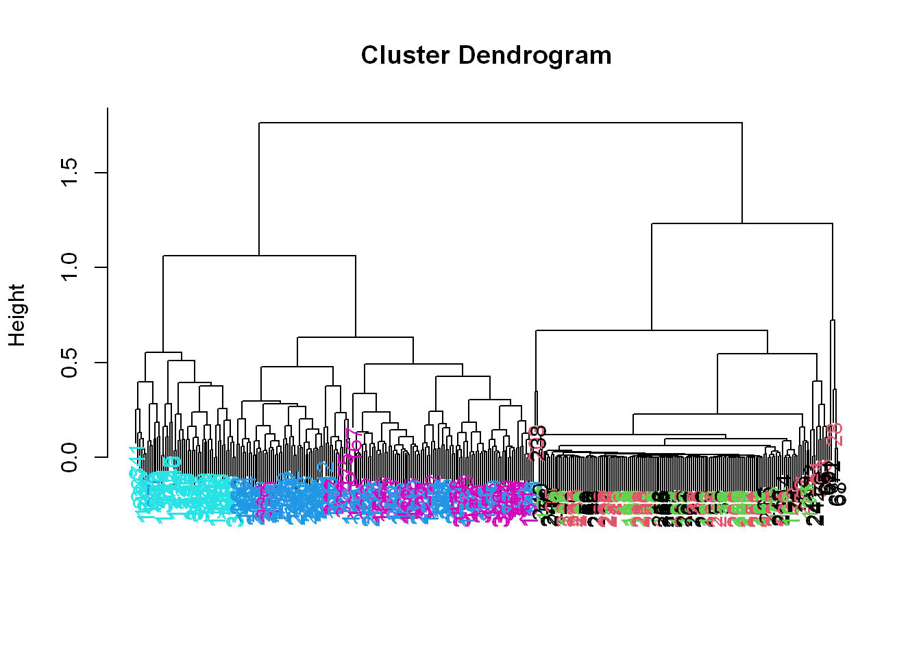
SVD
Here is a recap on Single Value Decomposition SVD:
We express a matrix X of observations (rows) and variables (columns) as the product of 3 other matrices, i.e.,
X=UDV^t.This last term(V^t)represents the transpose of the matrix V.
Left SV =u
To see the LEFT singular vectors of sub1, we’d look at svd1$u
Scale
Here is a recap on scale()
We have to scale mat from above, This means we subtract the column mean from every element and divide the result by the column standard deviation. R has a command for it scale(data matrix)
- Create the variable svd1 by assigning to it the output of
- A call to the svd(). The argument (data matrix) should be scale(sub1[,-c(1,2)]).
- This will remove the first 2 columns from sub1 and scale the data.
- Recall that the first 2 columns contain subject and activity information which we won’t need.
svd1 <- svd(scale(sub1[,-c(562,563)]))Let’s see the size of the matrix by using dim()
dim(svd1$u)[1] 347 347The matrix is 347 by 347, each row corresponding to a row in the matrix and each row has an activity associated with it.
Let’s look at the first few lines in svd1
svd1$d
[1] 3.260236e+02 1.293842e+02 8.541594e+01 7.121622e+01 5.756934e+01 5.149233e+01..
[11] 4.062862e+01 4.013605e+01 3.885361e+01 3.702627e+01 3.617854e+01 3.532184e+01.
$u
[,1] [,2] [,3] [,4] [,5]
[1,] 0.066141773 8.564579e-03 1.393664e-02 7.769934e-03 -1.191165e-01 ...
[2,] 0.061999938 8.370419e-03 -1.657104e-02 2.339682e-02 -3.932328e-02 ...
$v
[,1] [,2] [,3] [,4] [,5]
[1,] -1.174884e-03 4.823110e-02 -5.388370e-02 9.575945e-02 -3.957276e-02...
[2,] 2.344006e-03 1.528109e-02 -2.725214e-02 8.850550e-02 -7.504442e-02... Recap of SVD: we see that the function returns 3 components
- d holds the diagonal elements
- U column is for the left singular components of X
- V column is for the right singular components of X
Visualization
- Let’s look at the first two columns of the svd1 matrix
- Remember we extracted the original first two columns that had activity and subject data
- So the new subset svd1 will have the X values in column 1
- And the Y values in column 2
- Use solid points with pch=19
par(mfrow = c(1,2))
plot(svd1$u[,1], col=sub1$activity, pch=19)
plot(svd1$u[,2], col=sub1$activity, pch=19)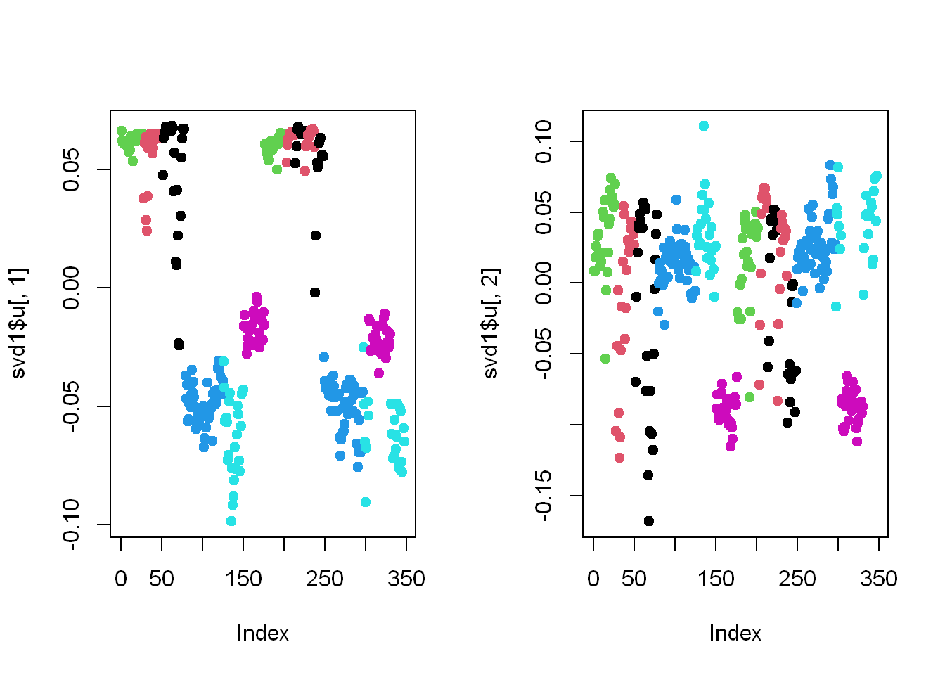
Here we’re looking at the 2 left singular vectors of svd1$u
- Each entry of the columns belongs to a particular row with one of the 6 activities assigned to it.
- We see the activities distinguished by color. Moving from left to right, the first section of rows are green (standing), the second red (sitting), the third black (laying), etc.
- The first column of u shows separation of the non-moving (black, red, and green) from the walking activities.
- The second column is harder to interpret, but
- The magenta cluster, which represents walking up, seems separate from the others. We’ll try to figure out why that is.
Right SV = v
Let’s find which of the 500+ measurements (represented by the columns of sub1) contributes to the variation of that component (the magenta=walkingup activity)
We’ve plotted the first two columns of the LEFT singular component above U, so
Let’s look at the RIGHT singular vectors (the columns of V), the second one since the separation of the magenta cluster stood out in the second column of svd1$u, so let’s look at the second column of v to see if anything is causing the cluster
Again, we are only plotting the second column of svd1$v as it appears to show separation for its magenta points
Visualization
Here’s a plot of the second column of svd1$v
plot(svd1$v[,2],col=alpha("black", 0.5), pch=19)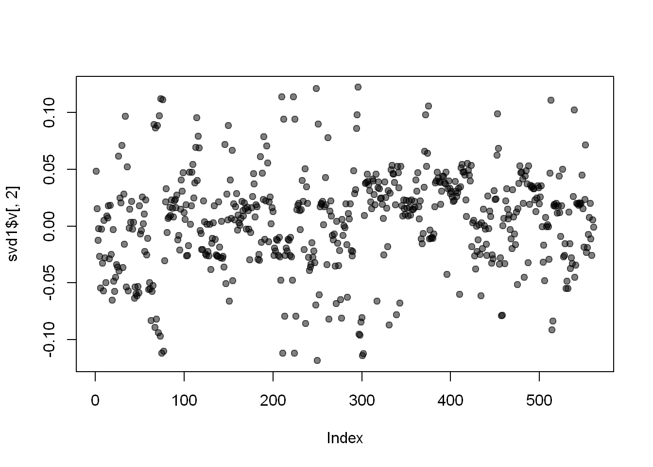
We used transparency in our plotting but nothing clearly stands out here. Let’s use clustering to find the feature (out of the 500+) which contributes the most to the variation of this second column of svd1$v.
Clustering
Create the variable maxContributor by assigning to it the output of the R command which.max using the second column of svd1$v as an argument.
maxContributor will represent the INDEX of the maximum value in the column
maxContrib <- which.max(svd1$v[,2])Let’s find out the index of maxContrib
maxContrib[1] 296Distance matrix
Now create a distance matrix
md by assigning to it the output of the R command dist using
4 columns of sub1 as the arguments
These 4 columns are 12 through 14 (12:14) and maxContrib.
Recall that you’ll have to concatenate these 2 column expressions when specifying them.
md <- dist(sub1[,c(10:12,maxContrib)])Clustering variable
hclustering
Now create hclustering, the output of the R command hclust using mdist as the argument, and
Call the myplclust with 2 arguments, hclustering and lab.col=
hcluster1 <- hclust(md)Let’s look at what’s in hclustering
hcluster1
Call:
hclust(d = md)

Cluster method   : complete
Distance         : euclidean
Number of objects: 347 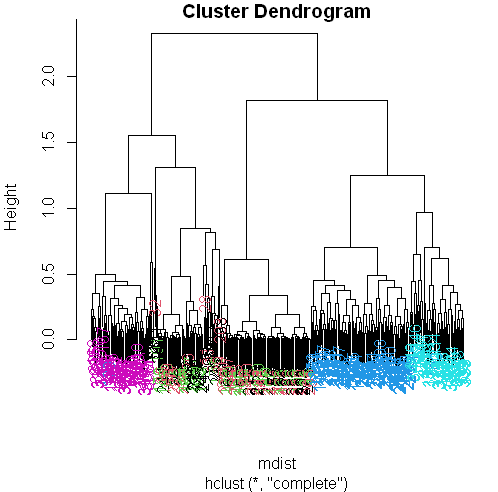
myplclust
Let’s plot the clustering variable hclustering
myplclust(hcluster1, lab.col = unclass(sub1$activity))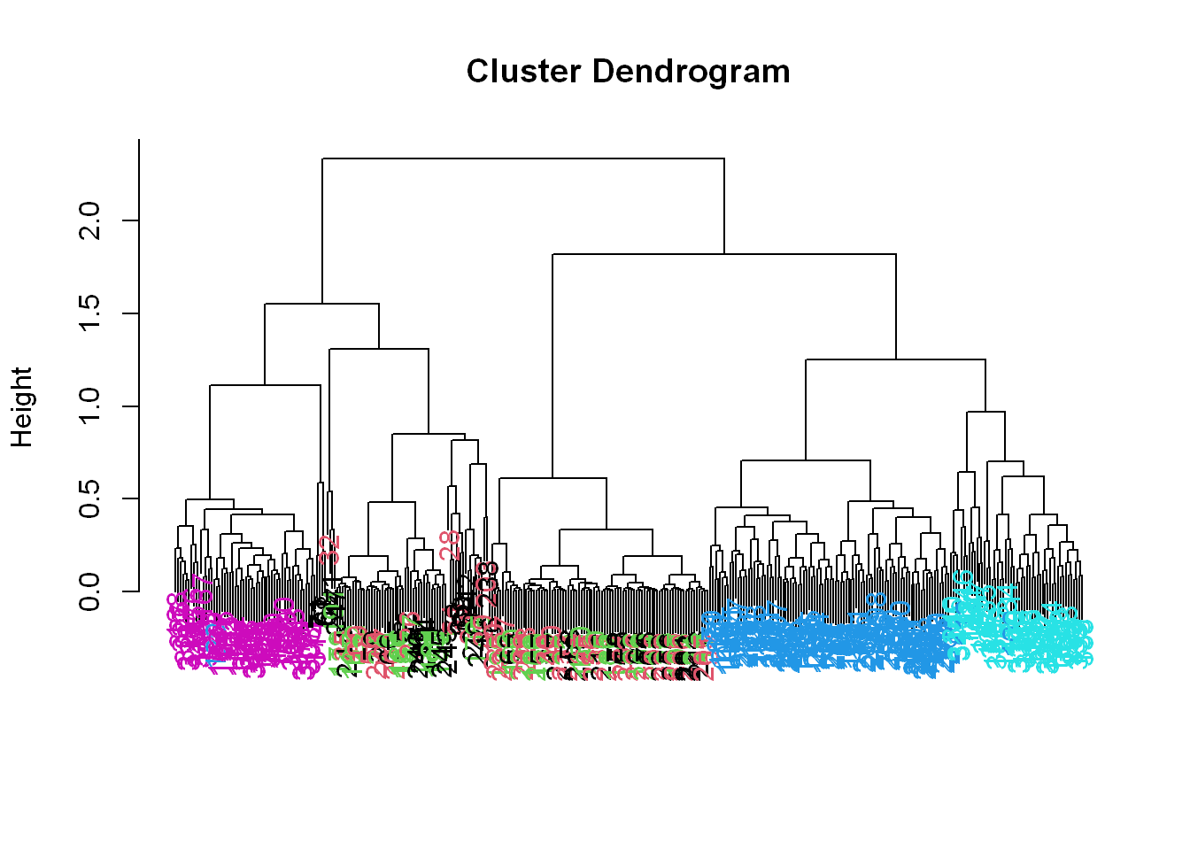
Now we see some real separation.
- Magenta (walking up) is on the far left, and the two other walking activities, the two blues, are on the far right, but in separate clusters from one another.
- The nonmoving activities still are jumbled together.
Max Contributor
Run the R command names with the argument sub1[maxContributor] to see what measurement is associated with this maximum contributor.
names(trainfile)[maxContrib][1] "fBodyAcc-meanFreq()-Z"So the mean body acceleration in the frequency domain in the Z direction is the main contributor to this clustering phenomenon we’re seeing.
Let’s move on to k-means clustering to see if this technique can distinguish between the activities.
K-means
Create the variable kClust by assigning to it the output of the R command kmeans with 2 arguments.
- The first is sub1 with the first 2 columns removed. (Recall these don’t have pertinent information for clustering analysis, as they contain the subject and activity)
- The second argument to kmeans is centers set equal to 6, the number of activities we know we have, which is the number of clusters we want to have. So this would be our first guess if we didn’t have any factors/groups already realized.
K-means clustering fist try
kClust <- kmeans(sub1[,-c(562,563)], centers=6)Recall that without specifying coordinates for the cluster centroids (as we did), kmeans will generate starting points randomly.
Here we did only 1 random start (the default). To see the output, run the R command table with 2 arguments.
- The first is kClust$cluster (part of the output from kmeans), and
- The second is sub1$activity.
- Let’s look at the breakdown of the clusters
table(kClust$cluster, sub1$activity)
    laying sitting standing walking walkingdown walkingup
  1     14      11        3       0           0         0
  2      0       0        0      95          49        53
  3      0       0       47       0           0         0
  4     27       0        0       0           0         0
  5      9       2        0       0           0         0
  6      0      34        3       0           0         0
K-means clustering second try
Here we’ll use the default again of nstart=1 but we’ll express it in the command. Above we didn’t express it and it used nstart=1 because it is the default. So whether you express it or not it’s the same.
But since we are going to run it again, let’s see if we notice any difference in the second try
kClust <- kmeans(sub1[,-c(562,563)], centers=6, nstart = 1)Let’s look at the breakdown of the clusters after the second run
table(kClust$cluster, sub1$activity)
    laying sitting standing walking walkingdown walkingup
  1      0       0        0       0          26         0
  2      0       0        0       0          23         0
  3     20      10        2       0           0         0
  4     27      37       51       0           0         0
  5      3       0        0       0           0        53
  6      0       0        0      95           0         0
Your exact output will depend on the state of your random number generator. We notice that - When we just run with 1 random start, the clusters tend to group the non-moving activities together in one cluster.
K-means start=100 first try
- The walking activities seem to cluster individually by themselves.
- You could run the call to kmeans with one random start again and you’ll probably get a slightly different result, but instead
- call kmeans with 3 arguments, the last of which will tell it to try more random starts and return the best one.
- The first 2 arguments should be the same as before (sub1 with the last 2 columns removed and centers set equal to 6).
- The third is nstart set equal to 100.
- Put the result in kClust again.
kClust <- kmeans(sub1[,-c(562,563)], centers=6, nstart = 100)Table
Again, run the R command table with 2 arguments.
- The first is part of the output from kmeans kClust$cluster, and
- The second is sub1$activity.
table(kClust$cluster, sub1$activity)
    laying sitting standing walking walkingdown walkingup
  1      0       0        0       0          49         0
  2     18      10        2       0           0         0
  3     29       0        0       0           0         0
  4      0       0        0      95           0         0
  5      0      37       51       0           0         0
  6      3       0        0       0           0        53
We see that even with 100 random starts, the passive activities tend to cluster together. One of the clusters contains only laying, but in another cluster, standing and sitting group together.
K-means start=100 second try
Let’s run it again
kClust <- kmeans(sub1[,-c(562,563)], centers=6, nstart = 100)Look at the breakdown
table(kClust$cluster, sub1$activity)
    laying sitting standing walking walkingdown walkingup
  1      0       0        0       0          49         0
  2     29       0        0       0           0         0
  3      0       0        0      95           0         0
  4      0      37       51       0           0         0
  5     18      10        2       0           0         0
  6      3       0        0       0           0        53
Cluster 1 Var Centers
Dimension
Find the dimensions of kClust$centers with
dim(kClust$centers)[1] 6 561So the centers are a 6 by 561 array. Sometimes it’s a good idea to look at the features of these centers to see if any dominate.
Laying
Create the variable laying and assign to it the output of the call to the R command which with the argument $size==29.
laying <- which(kClust$size==29)Now call plot with 3 arguments.
- The first is center[laying,1:10], and
- The second is pch set to 19
- The third is ylab set equal to “Laying Cluster”
plot(kClust$centers[laying,1:10], pch=19,ylab="Laying Cluster")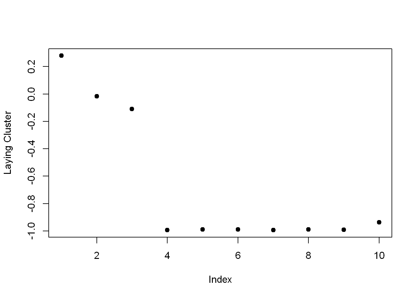
We see the first 1 and last two columns dominate this cluster center. Run names of those 3 columns of sub1 as the argument to remind yourself of what these columns contain.
names(sub1[1:3])[1] "tBodyAcc.mean...X" "tBodyAcc.mean...Y" "tBodyAcc.mean...Z"So the first 3 columns/variables seem to have the biggest effect on laying.
Walkingdown
Which
Create the variable walkdown and assign to it the output of the call to the R command which with the argument $size==49.
walkdown <- which(kClust$size==49)Plot
Now call plot with 3 arguments.
- The first is $centers[walkdown,3:14], and
- The second is pch set to 19.
- The third is ylab set equal to “Walkdown Cluster”
plot(kClust$centers[walkdown,1:10], pch=19,ylab="Walkdown Cluster")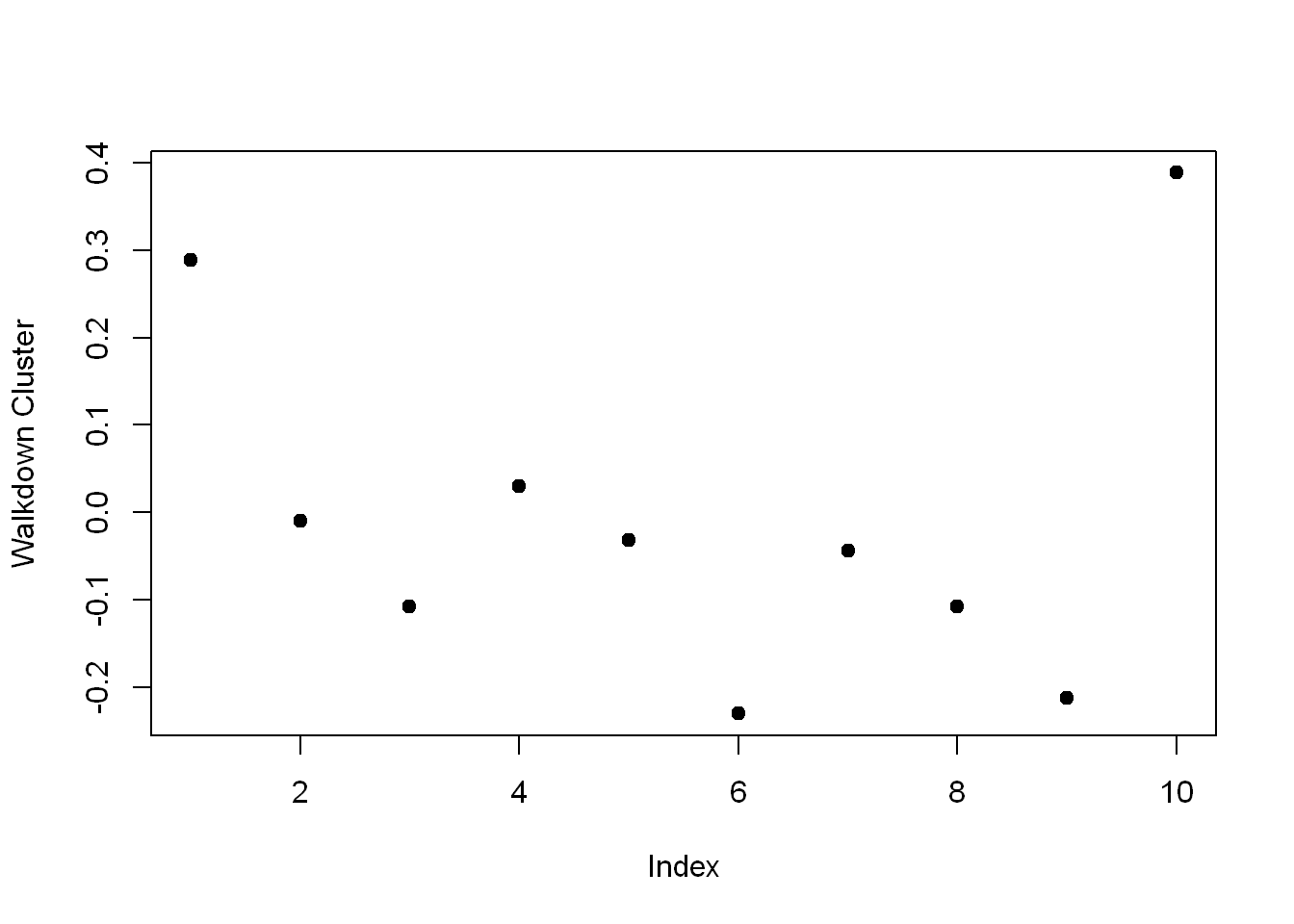
We see an interesting pattern here: From left to right, looking at the 12 acceleration measurements in groups of 3, the points decrease in value The X direction dominates, followed by Y then Z. This might tell us something more about the walking down activity.
We saw here that the sensor measurements were pretty good at discriminating between the 3 walking activities, but the passive activities were harder to distinguish from one another. These might require more analysis or an entirely different set of sensory measurements.