library(tidyverse)
library(plyr)EPA - EDA 1
Data
The U.S. Environmental Protection Agency (EPA) sets national ambient air quality standards for outdoor air pollution
For fine particle pollution (PM2.5), the “annual mean, averaged over 3 years” cannot exceed \(12~\mu g/m^3\).
Data on daily PM2.5 are available from the U.S. EPA web site https://www.epa.gov/air-emissions-inventories/national-emissions-inventory-nei
The EPA has a vast source of data for download and can be found (as of 2024) here: EPA enviro data downloads. Air quality data can be found here.
Fine particulate matter (PM2.5) is an ambient air pollutant for which there is strong evidence that it is harmful to human health. In the United States, the Environmental Protection Agency (EPA) is tasked with setting national ambient air quality standards for fine PM and for tracking the emissions of this pollutant into the atmosphere. Approximatly every 3 years, the EPA releases its database on emissions of PM2.5. This database is known as the National Emissions Inventory (NEI).
For each year and for each type of PM source, the NEI records how many tons of PM2.5 were emitted from that source over the course of the entire year. The data that we will use for this project are for 1999, 2002, 2005, and 2008.
The data was provided in a zip file and was saved locally. The zip file contains two files:
PM2.5 Emissions Data (rdssummarySCC_PM25.rds): This file contains a data frame with all of the PM2.5 emissions data for 1999, 2002, 2005, and 2008. For each year, the table contains number of tons of PM2.5 emitted from a specific type of source for the entire year.
Variables
Additional information on the data and file (summarySCC_PM25.rds):
- fips: A five-digit number (represented as a string) indicating the U.S. county
- SCCSCC: The name of the source as indicated by a digit string (see source code classification table)
- Pollutant: A string indicating the pollutant
- Emissions: Amount of PM2.5 emitted, in tons
- type: The type of source (point, non-point, on-road, or non-road)
- year: The year of emissions recorded
Source Classification Code Table (Source_Classification_Code.rds):
- This table provides a mapping from the SCC digit strings in the Emissions table to the actual name of the PM2.5 source.
- The sources are categorized in a few different ways from more general to more specific and you may choose to explore whatever categories you think are most useful.
- For example, source “10100101” is known as “Ext Comb /Electric Gen /Anthracite Coal /Pulverized Coal”.
Packages
List files
Before we unzip the file let’s see how many files are in it and confirm the information above.
unzip("D:/Education/R/Data/exdata_data_NEI_data.zip",list=TRUE) Unzip
unzip("D:/Education/R/Data/exdata_data_NEI_data.zip", exdir= "D:/Education/R/Data/EPA")We’ve seen this many times, if this is your first exposure to R, please follow along and you’ll later understand as we get through R. What’s important is we are reading the data into a data.frame called “pollution”
Read
con1 <- file("D:/Education/R/Data/EPA/summarySCC_PM25.rds")
con2 <- file("D:/Education/R/Data/EPA/Source_Classification_Code.rds")
NEI <- readRDS(con1)
SCC <- readRDS(con2)
Verify data
This file contains a data frame with all of the PM2.5 emissions data for 1999, 2002, 2005, and 2008. For each year, the table contains number of tons of PM2.5 emitted from a specific type of source for the entire year.
head(NEI) fips SCC Pollutant Emissions type year
4 09001 10100401 PM25-PRI 15.714 POINT 1999
8 09001 10100404 PM25-PRI 234.178 POINT 1999
12 09001 10100501 PM25-PRI 0.128 POINT 1999
16 09001 10200401 PM25-PRI 2.036 POINT 1999
20 09001 10200504 PM25-PRI 0.388 POINT 1999
24 09001 10200602 PM25-PRI 1.490 POINT 1999unique(NEI$year)[1] 1999 2002 2005 2008Case study
You must address the following questions and tasks in your exploratory analysis. For each question/task you will need to make a single plot. Unless specified, you can use any plotting system in R to make your plot.
Have total emissions from PM2.5 decreased in the United States from 1999 to 2008? Using the base plotting system, make a plot showing the total PM2.5 emission from all sources for each of the years 1999, 2002, 2005, and 2008.
Have total emissions from PM2.5 decreased in the Baltimore City, Maryland (fips == “24510”) from 1999 to 2008? Use the base plotting system to make a plot answering this question.
Of the four types of sources indicated by the typetype (point, nonpoint, onroad, nonroad) variable, which of these four sources have seen decreases in emissions from 1999–2008 for Baltimore City? Which have seen increases in emissions from 1999–2008? Use the ggplot2 plotting system to make a plot answer this question.
Across the United States, how have emissions from coal combustion-related sources changed from 1999–2008?
How have emissions from motor vehicle sources changed from 1999–2008 in Baltimore City?
Compare emissions from motor vehicle sources in Baltimore City with emissions from motor vehicle sources in Los Angeles County, California (fips == “06037”fips == “06037”). Which city has seen greater changes over time in motor vehicle emissions?
Case 1
Question
Have total emissions from PM2.5 decreased in the United States from 1999 to 2008? Using the base plotting system, make a plot showing the total PM2.5 emission from all sources for each of the years 1999, 2002, 2005, and 2008.
aggregate & plot
We have to be careful here, if we use histogram it will count the occurences (which is how many observations) and if we use barplot it will sum all the emission values for over 6M rows and it will take a long time.
An alternative would be to
Group the data by year
Sum the Emission per year
Create a new column for the yearly Emission totals and name it: Emm_per_year
save png
Save it all in a new df: emm_year
Plot and save as PNG file
emm_year <- NEI |> aggregate(Emissions ~ year, sum)

png(filename = "D:/yourdataiq/dataiq/images/plot1.png",
    width=480, height = 480, units = "px")
with(emm_year,
     plot(year,Emissions, type="l", col="green",
          lwd=2, ylab="totalPM2.5 emmission"))
dev.off()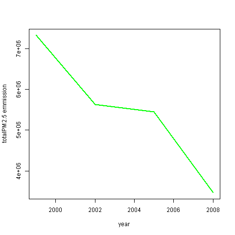
Case 2
Question
Have total emissions from PM2.5 decreased in the Baltimore City, Maryland (fips == “24510”) from 1999 to 2008? Use the base plotting system to make a plot answering this question.
subset aggregate & plot
First we’ll create a subset for Maryland using fips == “24510”
We group by year, sum the Emission for each year and save in a new column Emm_per_year
save png
- Plot and save the visualization in PNG file
maryland <- subset(NEI, fips == "24510")
maryland_emm <- maryland |> aggregate(Emissions ~ year, sum)

png(filename = "D:/yourdataiq/dataiq/images/plot2.png",
        width=480, height = 480, units = "px")
with(maryland_emm,
        plot(year, Emissions, type="l", col="blue",
        lwd=2, ylab="totalPM2.5 emmission"))
dev.off()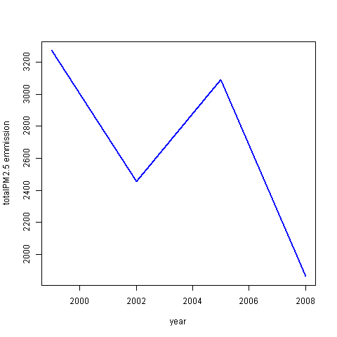
Case 3
Question
Of the four types of sources indicated by the typetype (point, nonpoint, onroad, nonroad) variable, which of these four sources have seen decreases in emissions from 1999–2008 for Baltimore City? Which have seen increases in emissions from 1999–2008? Use the ggplot2 plotting system to make a plot answer this question.
2 variables & filter
group_by & facet_wrap
We already have the data filtered for Baltimore above so we use the filtered df
Group the data by both year and type
Calculate the yearly Emission for each type and save in new column
Use facet_wrap to split the plots per type
save png
scales
Use scales = “free” to allow each plot to control it’s own y-axis range
type_grp <- maryland |> aggregate(Emissions ~ year + type, sum)

png(filename = "D:/yourdataiq/dataiq/images/plot3.png",
    width=480, height = 480, units = "px")
ggplot(type_grp, aes(year,Emissions )) +
        geom_line(aes(color=type, lwd=.1 )) +
        facet_wrap(~type, scales = "free") +
        labs( y="totalPM2.5 emmission")
dev.off()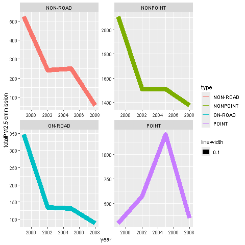
2 vars aggregate & 1 filter
aggregate
We’ll use the aggregate() with 3 variables instead of grouping
only_maryland <- subset(NEI, fips=="24510")

type_yearly <- only_maryland |>
        aggregate(Emissions~year + type, sum)

png(filename = "D:/yourdataiq/dataiq/images/plot3.png",
    width=480, height = 480, units = "px")
ggplot(type_yearly, aes(year,Emissions )) +
        geom_line(aes(color=type, lwd=.1 )) +
        facet_wrap(~type, scales = "free") +
        labs( y="totalPM2.5 emmission")
dev.off()
Case 4
Question
Across the United States, how have emissions from coal combustion-related sources changed from 1999–2008?
grepl
First we look in SCC the file that describes all the SCC codes and their meanings
To extract all coal related emissions we’ll use SCC$EI.Sector and extract any row that has “- Coal” in it
Set data into coal_filter
match_df
Now that we have a df of all the coal related codes
Use match_df to find all the rows in NEI (the original dataset) that include an SCC code that’s in coal_filter
aggregate
- Use aggregate to calculate the sum of all Emissions per year
save png
- Plot and save the visual as a PNG file
coal_filter <- SCC |>
        filter(grepl("- Coal", EI.Sector))

matched_coal <- match_df(NEI, coal_filter, on="SCC")
coal_yearly <- matched_coal |>
        aggregate(Emissions~year, sum)

png(filename = "D:/yourdataiq/dataiq/images/plot4.png",
    width=480, height = 480, units = "px")
with(coal_yearly,plot(year,Emissions, type="l", lwd=2, col="blue"))
dev.off()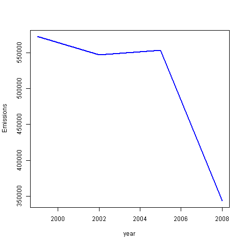
Case 5
Question
How have emissions from motor vehicle sources changed from 1999–2008 in Baltimore City?
grepl
Just as we did above let’s look in the SCC/EI.Sector description for any motor vehicle related emission observations
Extract the filtered data into mv_filter
match_df
- Use match_df to find all the rows in the original df NEI that match the SCC of the rows we extracted
subset
- Subset all observations for the city of Baltimore fips == 24510
aggregate
- Calculate the sum of all Emissions using the aggregate()
save png
mv_filter <- SCC |>
        filter(grepl("Mobile.*|vehicle.*", EI.Sector))

matched_rows <- match_df(NEI, mv_filter, on="SCC")
maryland_mv <- subset(matched_rows, fips=="24510")

mary_mv_yearly <- maryland_mv |>
        aggregate(Emissions~year, sum)

png(filename = "D:/yourdataiq/dataiq/images/plot5.png",
    width=480, height = 480, units = "px")
with(mary_mv_yearly,plot(year,Emissions,col="blue",lwd=2, type="l"))
dev.off()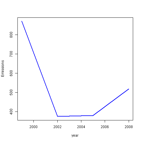
Case 6
Question
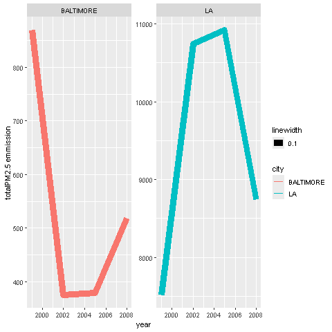
Compare emissions from motor vehicle sources in Baltimore City with emissions from motor vehicle sources in Los Angeles County, California (fips == “06037”). Which city has seen greater changes over time in motor vehicle emissions?
grepl
- Most of the work is done for us in case 5 so we can copy the code for Maryland down.
subset
- We just have to subset the motor vehicle df mv_df for LA fips == “06037”
aggregate
- Use aggregate to calculate the sum of Emissions per year
add a column
We’ll add a new column to both aggregate df, name the column city
For Baltimore, insert the string “BALTIMORE” in the new column city
For LA insert the string “LA” in the new column city
row bind
Bind the two df using rbind to make it a long df
Now instead of having two 4x2dfs we will have one 8x3 df
facet_wrap
- Now we can plot using facet_wrap to have both plots side by side
scales = “free”
The first plot I’ll omit scales parameter to allow the plots to share the same y axis
Note the values for LA are much larger than those in Baltimore
save png
mv_filter <- SCC |>
        filter(grepl("Mobile.*|vehicle.*", EI.Sector))
matched_rows <- match_df(NEI, mv_filter, on="SCC")

maryland_mv <- subset(matched_rows, fips=="24510")
mary_mv_yearly <- maryland_mv |>
        aggregate(Emissions~year, sum)
mary_mv_yearly$city <- "BALTIMORE"

la_mv <- subset(matched_rows, fips=="06037")
la_mv_yearly <- la_mv |>
        aggregate(Emissions~year, sum)
la_mv_yearly$city <- "LA"

bound_cities <- rbind(mary_mv_yearly,la_mv_yearly)

png(filename = "D:/yourdataiq/dataiq/images/plot6.png",
    width=480, height = 480, units = "px")
ggplot(bound_cities, aes(year, Emissions))+
        geom_line(aes(color=city, lwd=.1 )) +
        facet_wrap(~city) +
        labs( y="totalPM2.5 emmission")
dev.off()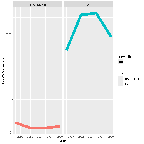
independent y-range
The second plot I used scales=“free” to allow each plot to dictate its own y-range
Pretend you zommed in on the left plot to inspect how steep the rise in the Emission was for 2008
png(filename = "D:/yourdataiq/dataiq/images/plot7.png",
    width=480, height = 480, units = "px")
ggplot(bound_cities, aes(year, Emissions))+
        geom_line(aes(color=city, lwd=.1 )) +
        facet_wrap(~city, scales = "free") +
        labs( y="totalPM2.5 emmission")
dev.off()